Food Empire
An identity the brand could own
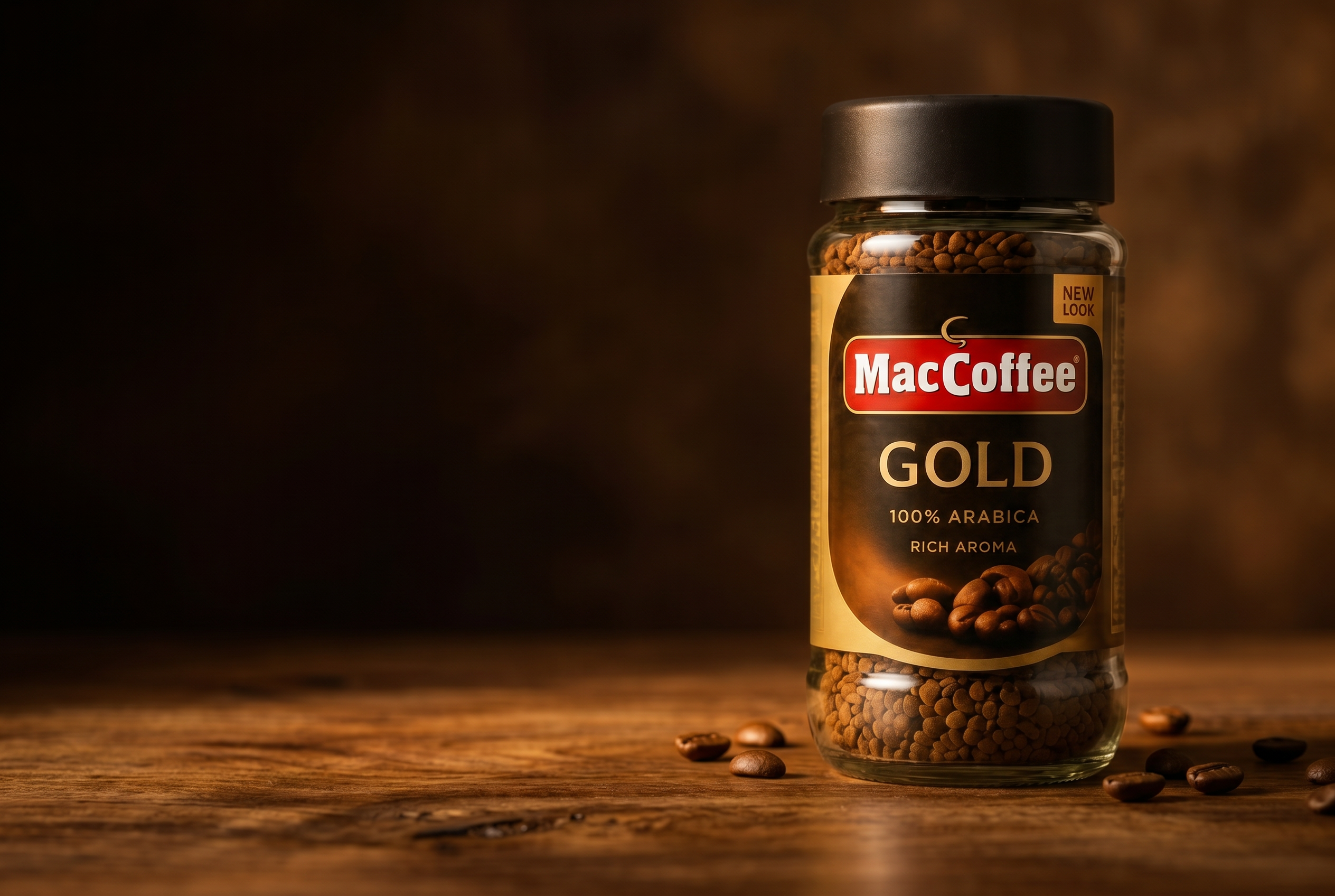
Phoenix helped Food Empire move beyond generic jar formats with custom glass and proprietary caps, creating a packaging system built for brand distinction, not imitation.

Packaging needed to match the product proposition.

Available formats lacked distinction.

A more ownable shelf silhouette.

Components designed to work together.

Packaging competitors cannot casually copy.
When the shelf looks the same, the brand disappears
Standard jars deliver the product efficiently — but they're shared across categories, so premium ends up wearing the same silhouette as commodity.
Food Empire needed a jar and cap system specific to them — one that owned a stronger shelf silhouette and a more defensible identity.
- — Eliminated shelf difference
- — Proprietary cap system
- — Design ownership, not off-the-shelf
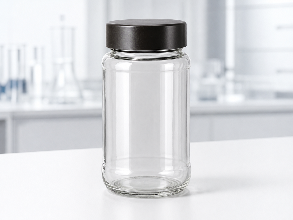
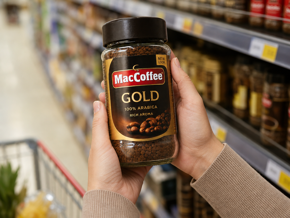
One jar, from first sketch to finished pack
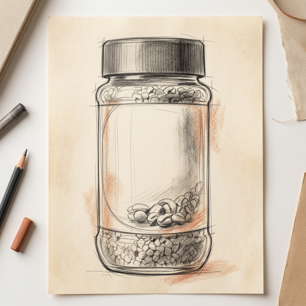
Design sketch
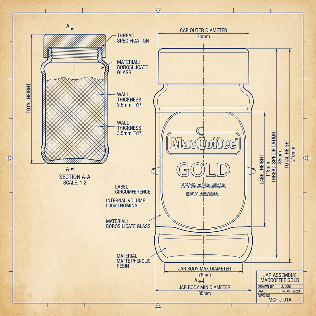
Technical drawing
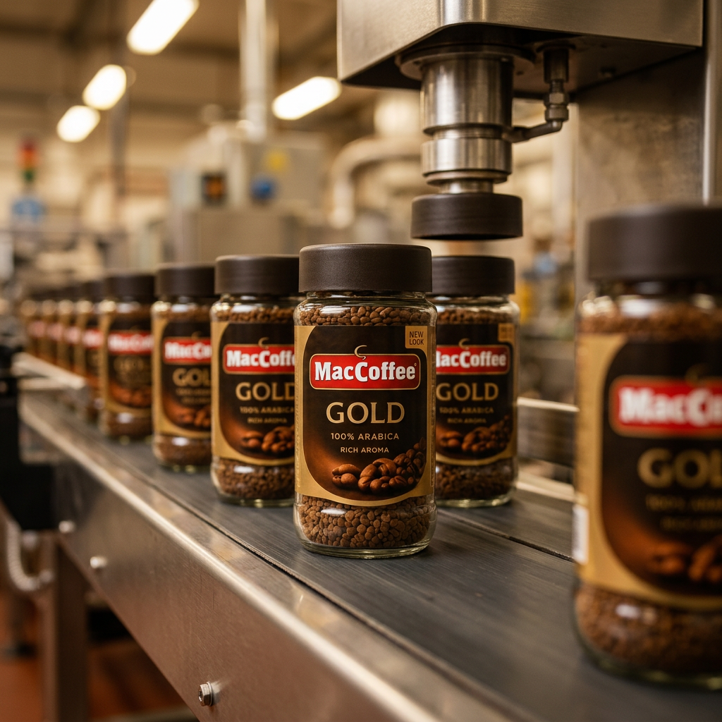
Production
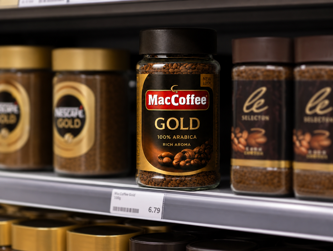
On shelf
A packaging system, not just a jar
Every detail developed with intent. Engineered for performance, designed to deliver consistency — and built to hold the shelf.
Custom glass jar profile
Distinct silhouette that signals the brand on shelf.
Label panel for premium cues
Surface designed for refined print and finishes.
Closure compatibility
Engineered to pair with the proprietary cap.
Technical drawings and dimensions are illustrative and provided for design-development purposes only. Final specifications are subject to technical review, sampling and production approval.
Proprietary cap fit
Designed and toleranced as one system, not stock parts.
Distinctive shelf silhouette
Recognisable from a distance and at glance.
Production-ready specification
Built to run repeatably at line speed.
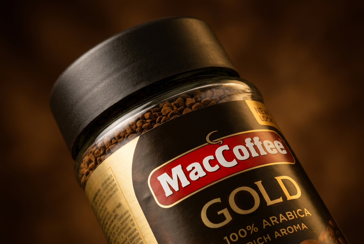
The cap is the system's signature
A proprietary closure is the part of the packaging system competitors find hardest to copy. It carries the brand silhouette at eye level, sets the perceived quality of the open-and-close action, and locks the jar profile into a relationship that off-the-shelf parts cannot easily reproduce.
Distinctive packaging, commercially viable
The hard part of proprietary packaging is not the design. It is making the design produce-able, repeatable and commercially sensible at the right volume. Phoenix coordinated all three through one accountable route.
Custom design made viable
Phoenix helped make proprietary packaging practical without forcing the brand back into standard stock formats.
Packaging identity protected
A custom jar and cap system gives the brand a more ownable format and makes imitation harder.

Supply route built for repeatability
The packaging system was designed as a repeatable route, not a one-off visual experiment.
A packaging system that belongs to the brand
Phoenix's model helps brands move beyond catalogue packaging by coordinating design intent, mould development, component fit and production readiness through one accountable route. For Food Empire, that meant a jar and cap system that could carry the premium coffee proposition with more authority.
Owning packaging design is more than aesthetic. It changes how the product behaves on shelf, how distributors talk about it, and how easily a competitor can encroach on its visual territory. A proprietary format is a quiet but durable form of brand defence.

We were not choosing a jar. We were building a brand asset.
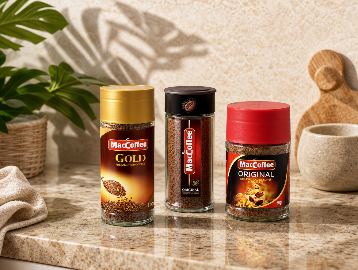
Design only matters if it can be made consistently
Custom packaging has to perform in production. Closures need consistent fit. Labels need reliable application surfaces. Repeatability protects both quality and cost — and quietly defines whether a proprietary system can scale or collapses back into the stock-format compromise.
Phoenix worked through dimensional checks, closure torque validation and line-speed testing with the partner plant network so the jar and cap system arrived ready to run — not as a prototype that needed engineering to catch up.
Distinctive on shelf. Harder to imitate
Stronger shelf presence
Owned packaging format
Proprietary cap and jar pairing
Premium product cues strengthened
Ongoing design partnership
Built for future range extension.
One accountable partner across every packaging layer


Bottles & jars
Custom glass forms engineered for the brand, not chosen from a catalogue.
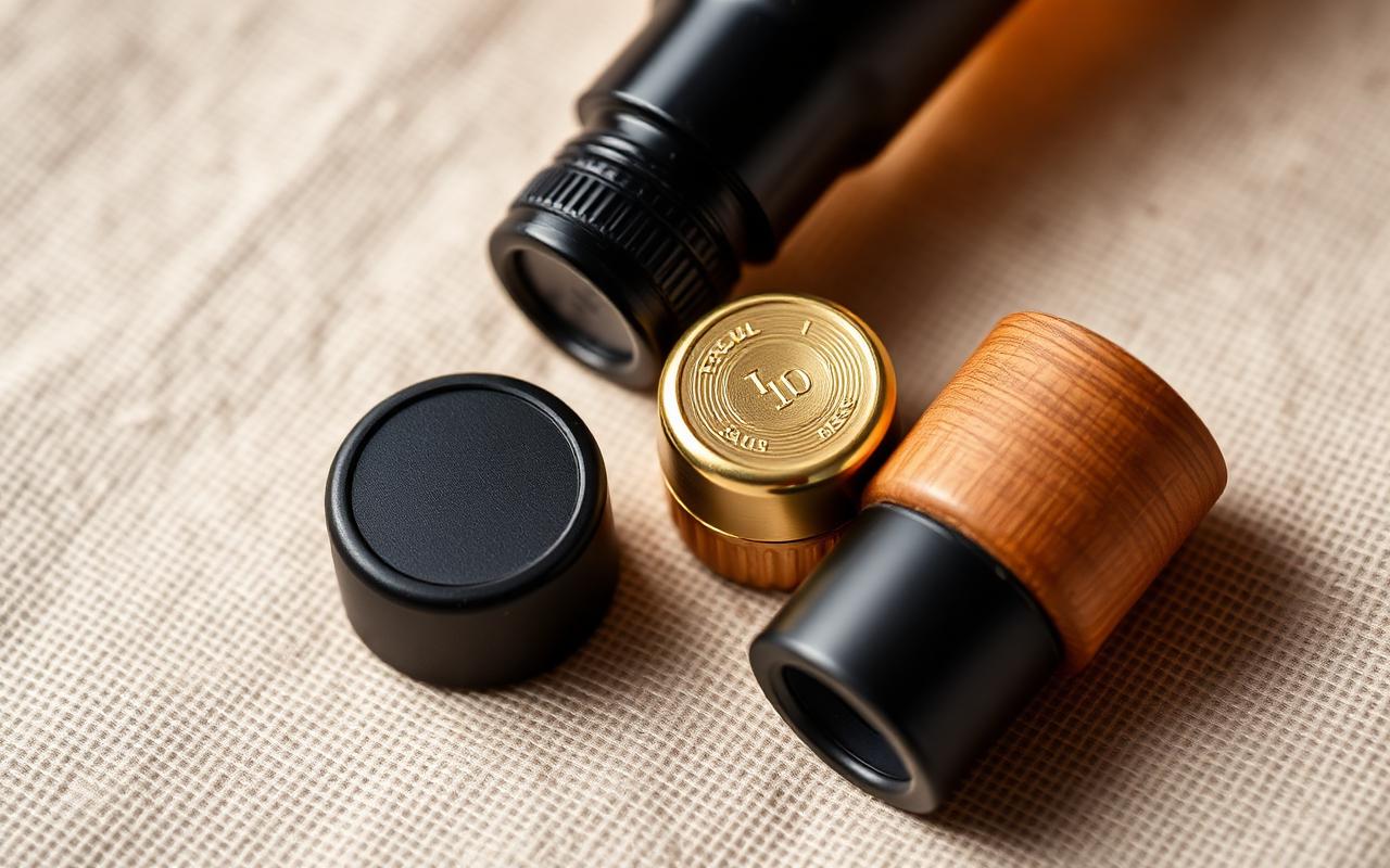

Closures
Proprietary caps toleranced to the jar so the pack behaves as one system.
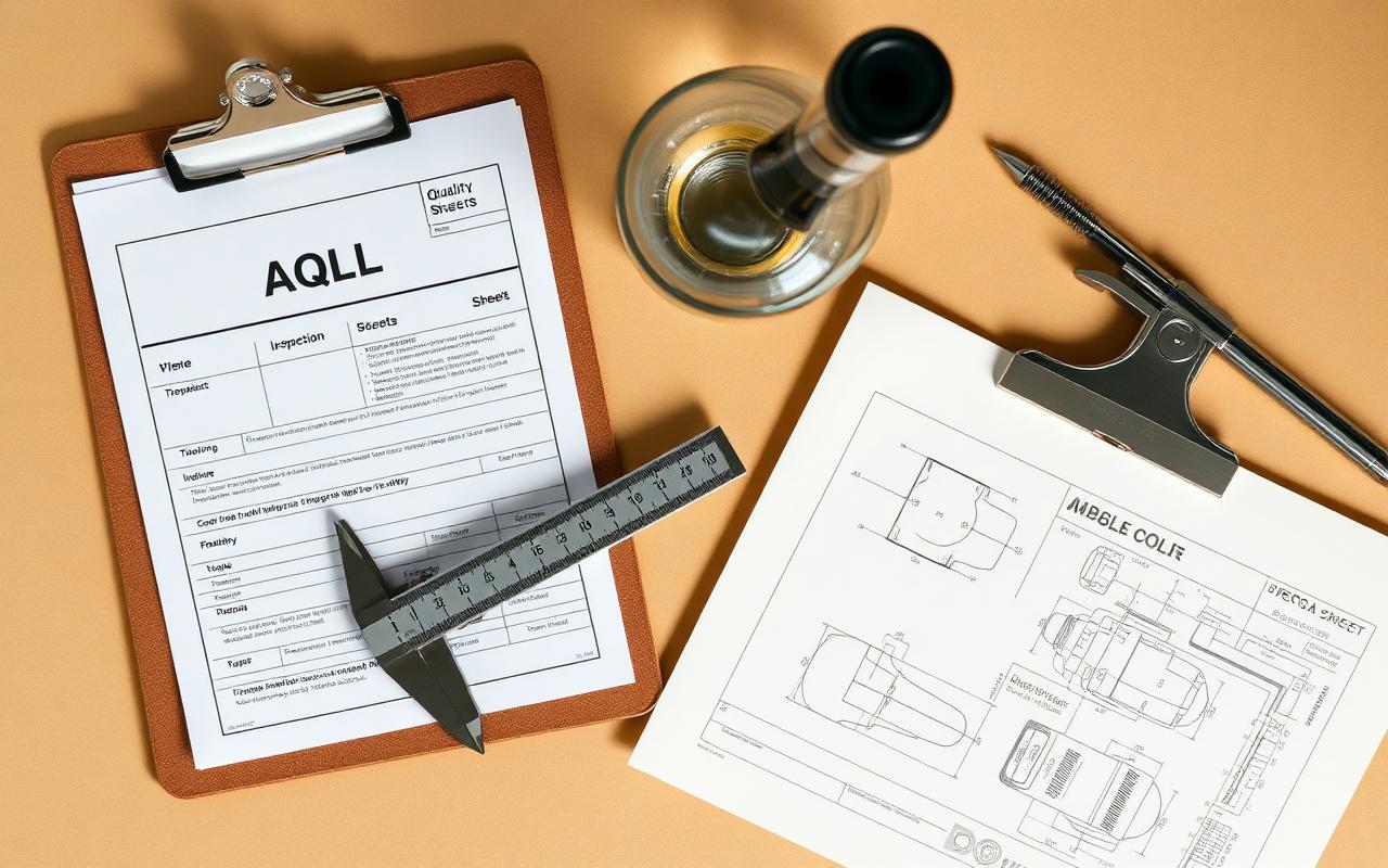

Quality documentation
AQL inspection, dimensional checks and specification sign-off at source.


Packing & delivery
Cartons, pallet planning and export coordination through one accountable route.
The full toolkit behind this case


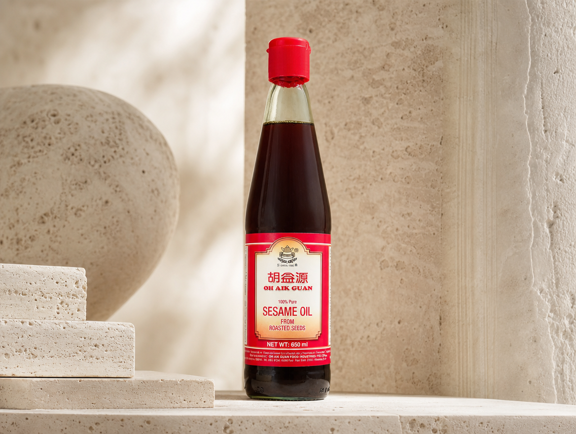
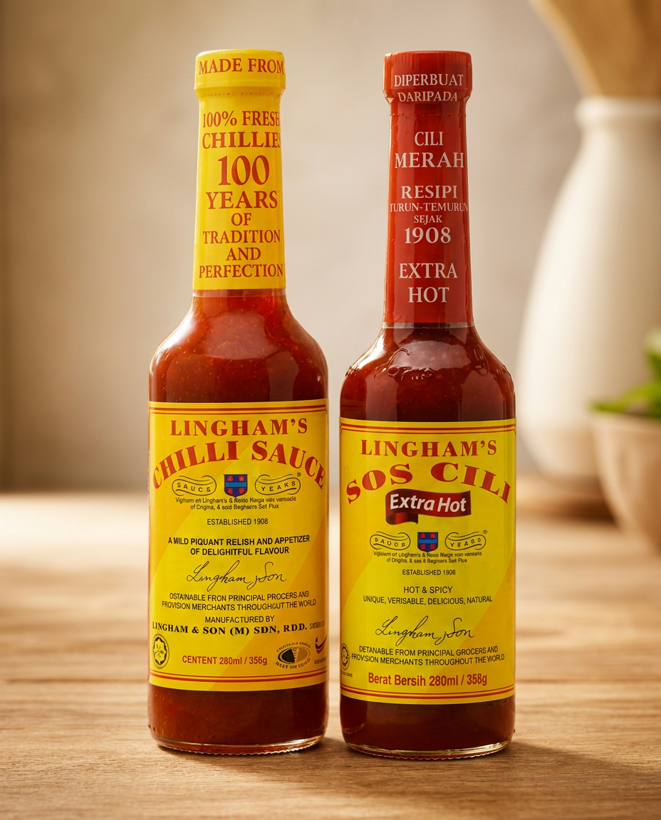
See how Phoenix solves different packaging challenges
Each customer story shows a different route from packaging constraint to commercial progress.

Frequently asked questions
Short, practical answers to the questions buyers and brand teams ask us most when packaging is the constraint.
What packaging problem did Phoenix solve for Food Empire?

Standard catalogue jars made a premium coffee product look like every other jar on the shelf. Phoenix designed a custom glass jar and proprietary cap system — built as one engineered pair rather than off-the-shelf parts — so the product carries its own shelf silhouette, supports premium label finishes and becomes harder for competitors to imitate.
Why do standard jars weaken premium shelf presence?
Stock jars are designed to do one thing efficiently: hold product. They are shared across categories and brands, which means a premium positioning ends up wearing the same silhouette as a commodity one. On a crowded shelf, sameness reads as 'generic' before a label has a chance to communicate anything. A proprietary format gives the brand its own outline at a distance.
What is a proprietary jar and cap system?
It is a packaging set where the glass jar and the closure are designed and toleranced together, not paired from separate catalogues. That means the cap fits one specific jar profile, the label panel is sized for premium finishes, and the production specification is repeatable. The brand owns the combination rather than renting it from a stock list.
Which Phoenix capabilities were involved?
Custom glass jar design, proprietary closure development, mould route coordination, surface finish work for label and decoration, plus quality and fit testing to confirm the system runs reliably on line. The work was scoped as one packaging system, not a sequence of disconnected components.
Let's build the packaging your brand truly deserves.
From identity-led design to production-ready supply.